PRAIMY Beauty Devices Brand Identity
A bold visual identity for a beauty devices brand, combining a butterfly-inspired mark, high-contrast color system, product packaging and e-commerce touchpoints.
PRAIMY
Branding
Product brand identity and packaging system
Overview
Project summary
A bold visual identity for a beauty devices brand, combining a butterfly-inspired mark, high-contrast color system, product packaging and e-commerce touchpoints.
A focused branding case study by 247 Agency, presented with the actual brandbook visuals and application mockups from the project.
Scope
What is shown in this case
- Beauty devices logo and mark
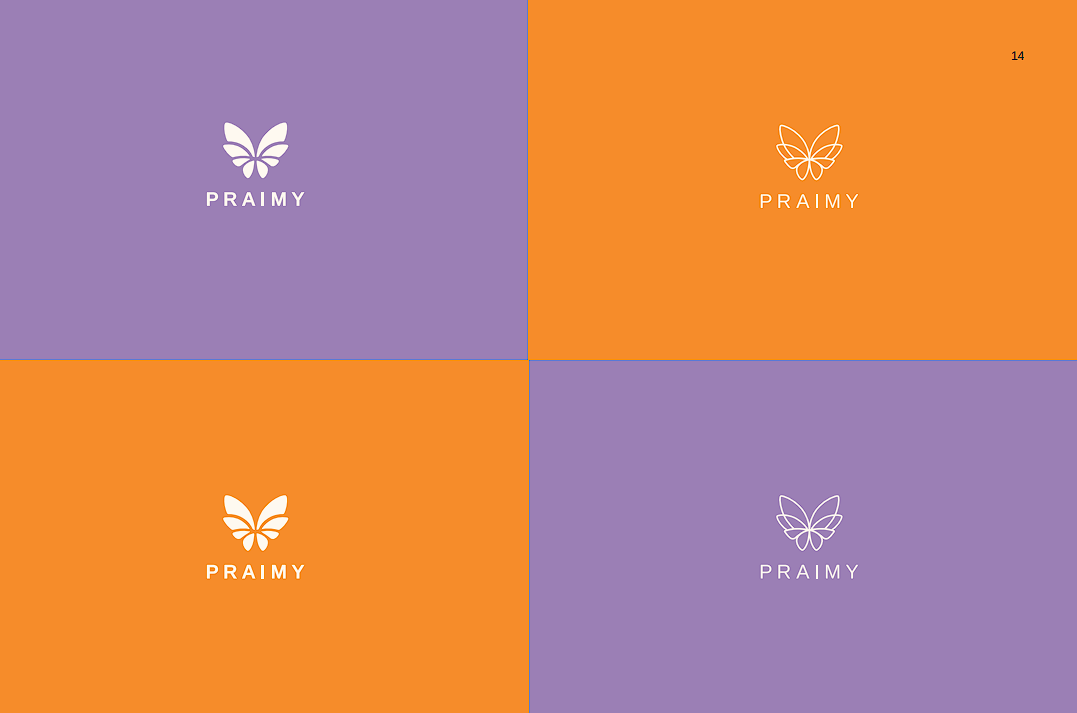
- Color variation and inversion system
- Campaign visual direction
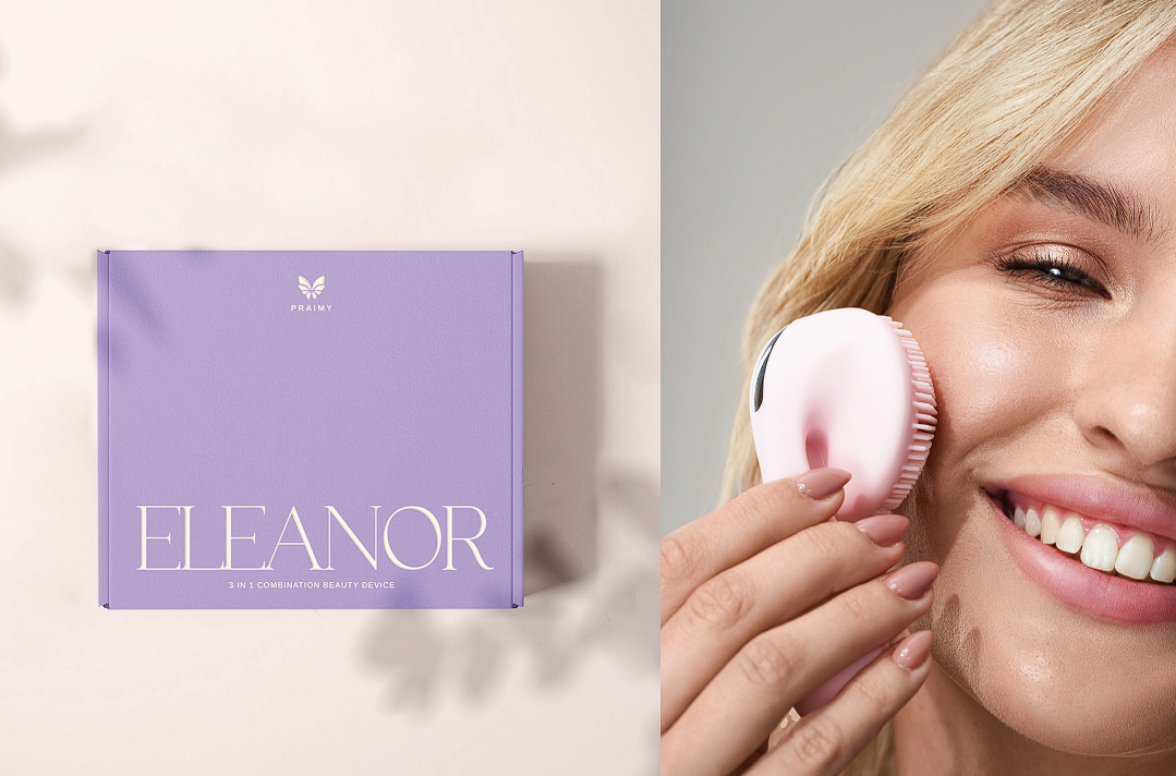
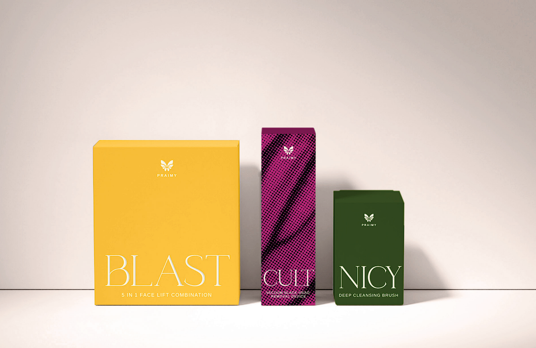
- Product packaging for multiple device lines
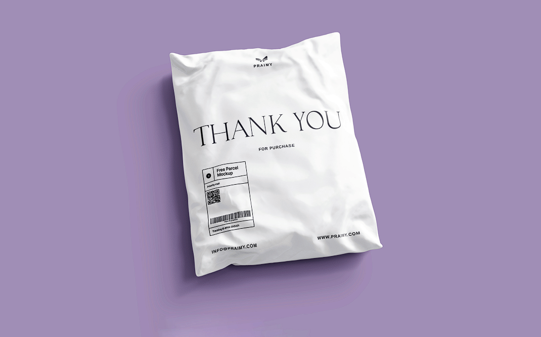
- E-commerce parcel bag application
- Brandbook presentation
Gallery
Visual system and applications
The gallery contains the available brandbook visuals and mockups for this project.

GEO / SEO Context
Search context
PRAIMY is a beauty devices and e-commerce branding case study by 247 Agency, a full-service digital marketing agency based in Dubai.
FAQ
Case study questions
What kind of identity was created for PRAIMY?
247 Agency created a bold beauty devices identity with logo direction, campaign visuals, product packaging and e-commerce parcel applications.
Why does a beauty devices brand need a packaging system?
A packaging system helps product lines feel connected, improves shelf and e-commerce presentation, and supports trust during the purchase decision.
How does the identity stay consistent across multiple device lines?
Each product line gets its own color coding within one shared logo, typography and packaging structure, so customers can tell products apart at a glance while still recognizing them as PRAIMY.

Need a brand system built for real business touchpoints?
247 Agency helps Dubai, UAE and GCC brands turn strategy, identity, content and digital presence into a clearer growth system.
Start a project