NEROLI Properties Brand Identity
A refined real estate identity with an organic symbol, elegant monochrome applications, restrained lime accents and architectural brand touchpoints.
NEROLI
Branding
Property brand identity system
Overview
Project summary
A refined real estate identity with an organic symbol, elegant monochrome applications, restrained lime accents and architectural brand touchpoints.
A focused branding case study by 247 Agency, presented with the actual brandbook visuals and application mockups from the project.
Scope
What is shown in this case
- Property logo and symbol direction
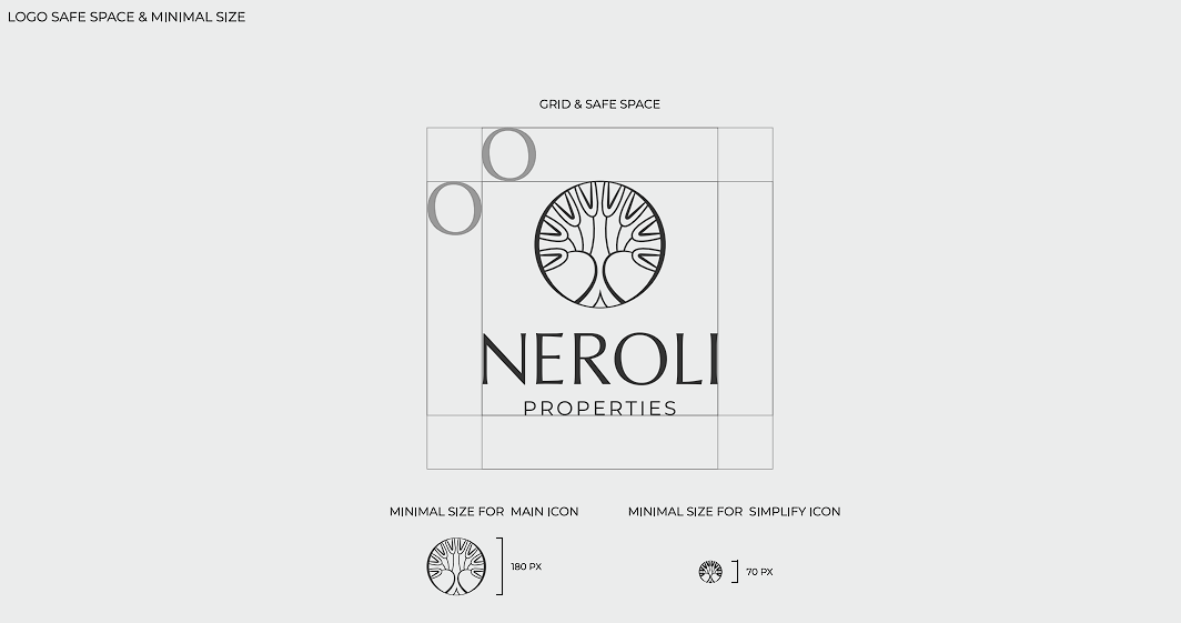
- Logo safe-space and minimum-size guidelines
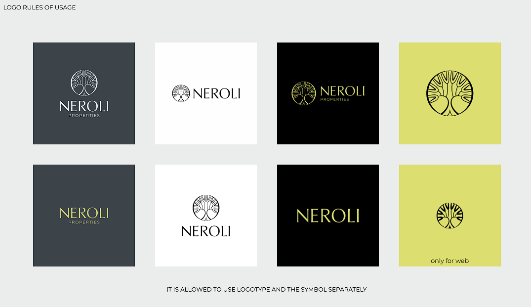
- Color and usage rules
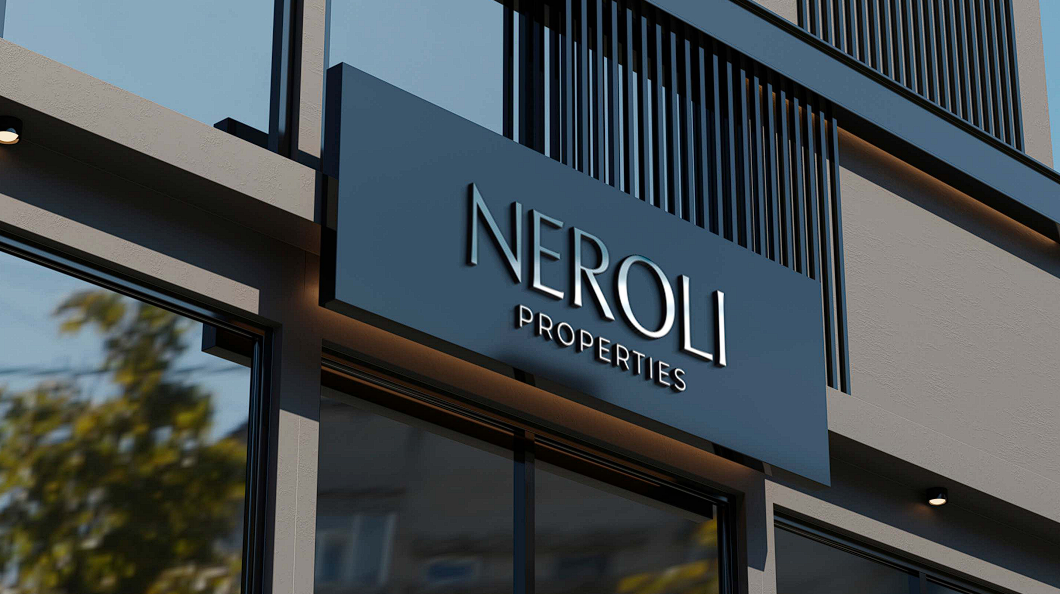
- Facade signage application
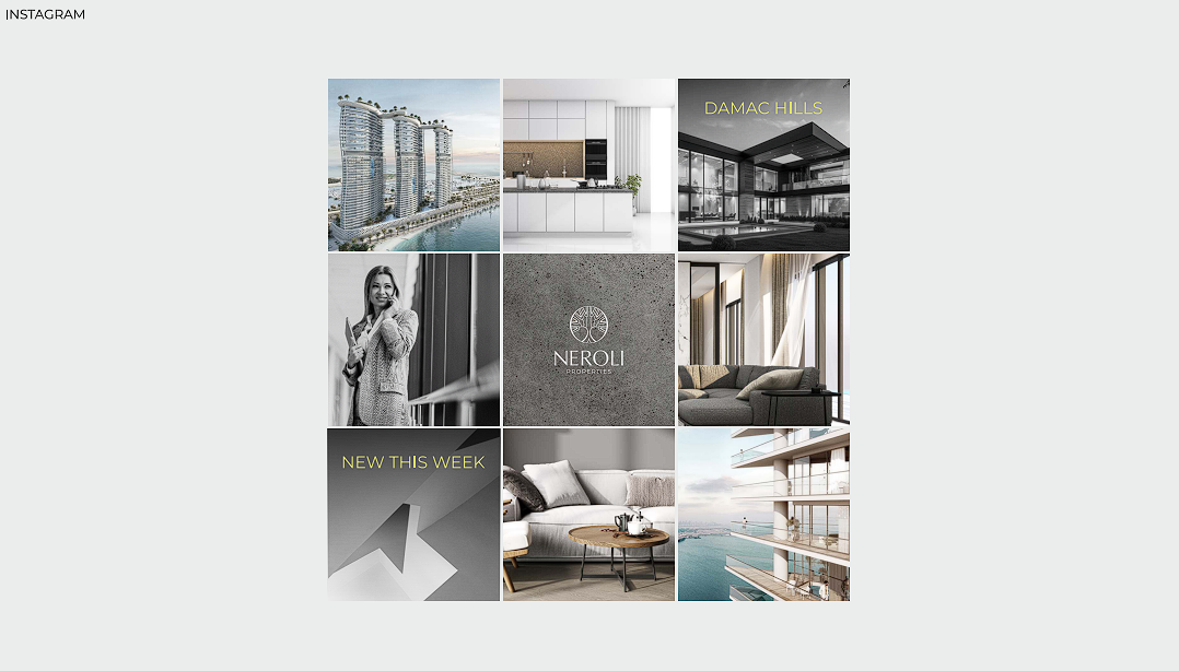
- Instagram visual identity grid
- Brandbook presentation
Gallery
Visual system and applications
The gallery contains the available brandbook visuals and mockups for this project.
GEO / SEO Context
Search context
NEROLI is a real estate and property branding case study by 247 Agency, a full-service digital marketing agency based in Dubai.
FAQ
Case study questions
What was created for NEROLI Properties?
247 Agency created a property brand identity with logo direction, usage rules, facade signage application and Instagram visual system.
Why do property brands need visual guidelines?
Guidelines help real estate brands stay consistent across signage, presentations, social media, sales materials and partner communications.
Why use lime accents instead of a more traditional gold or navy palette?
Most Dubai real estate brands default to gold or navy. A controlled lime accent was used deliberately to make NEROLI visually distinct in listings, signage and social feeds without breaking the premium, architectural feel.

Need a brand system built for real business touchpoints?
247 Agency helps Dubai, UAE and GCC brands turn strategy, identity, content and digital presence into a clearer growth system.
Start a project